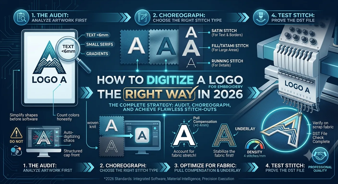
How to Digitize a Logo for Embroidery the Right Way in 2026
Most people who ruin an embroidery job never touch the wrong setting on their machine. They ruin it three days earlier, the moment they open a logo file and start digitizing without a plan.
That's the thing nobody tells you upfront. Embroidery digitizing isn't a software problem. It isn't even a technique problem, most of the time. It's a thinking problem — specifically, the failure to understand that you're not tracing a logo. You're translating it into an entirely different language. Thread isn't ink. A 72dpi PNG doesn't become a clean satin stitch just because you've drawn a path around it. And auto-digitizing software — bless its cotton socks — will happily produce 14,000 stitches of absolute chaos and call it done.
This guide walks you through how to digitize a logo for embroidery the right way. Not the fast way. The right way — the one that doesn't end with you ripping stitches out of 200 polos at midnight.
We'll cover what digitizing actually means at a technical level, how to audit your logo before you open a single piece of software, which stitch types to use for which logo elements, and when to hand the job to a professional instead of burning a weekend on it yourself.
Why "Just Trace the Logo" Is the Most Expensive Mistake in Embroidery
Let's clear something up immediately, because the confusion between vectorizing and digitizing destroys more files than any other single misconception.
Vectorizing vs. Digitizing: The Core Difference
Vectorizing means converting a raster image — your JPEG, PNG, whatever the client emailed you — into scalable vector paths in a format like SVG or AI. That's a graphic design task. The output is still just geometry. It tells you where shapes are. It tells you nothing about how thread behaves.
Digitizing is something categorically different. When you digitize a logo for embroidery, you're making hundreds of individual decisions: what stitch type covers each element, what direction those stitches run, how densely they're packed, what order the machine sews them, and how much you compensate for the fact that fabric pulls and distorts as stitches go in.
Understanding Stitch Logic and Fabric Behavior
A logo that looks immaculate on screen — sharp gradients, hairline details, a drop shadow — can look absolutely battered once it's sewn onto a fabric that has any give to it. Knit polos. Fleece. Cap fronts. They all move. And they don't care how good your artwork is.
Here's the thing: stitch logic is the whole job. The software is just a tool for expressing those decisions. I've seen files built in Wilcom — arguably the most powerful embroidery software on the market — that were complete disasters because the person using it didn't understand pull compensation. And I've seen files built in free software that stitched beautifully because the digitizer understood what the fabric was going to do.
The mental model shift you need: You're not drawing. You're choreographing.
Every element in your logo becomes a sequence of machine movements. A filled block of colour? That's thousands of parallel stitches laid down in a specific direction to achieve coverage without puckering. A thin border? Probably a satin stitch column, 2mm wide, with an underlay run beneath it to stabilise the fabric first. Text smaller than 6mm tall? You may need to simplify it significantly — or cut it entirely.
I've digitized enough of these to tell you that the logos which cause the most production headaches aren't the complex ones. They're the ones that look simple but haven't been properly audited before anyone touched the software.
The Pre-Digitizing Audit That Separates Good Files from Expensive Nightmares
Before you open Hatch, Wilcom, Ink/Stitch, or whatever you're using — stop. Spend 20 minutes with the original artwork. This audit alone will save you hours.
1. Evaluate Minimum Size Thresholds First
If the finished embroidery is going on a left chest — standard placement, roughly 90mm × 90mm — and your logo has text under 6mm tall, that text won't read cleanly in satin stitch. At 4mm cap height, most sans-serif fonts become a blur. At 3mm, you're basically adding texture rather than readable letters. If it won't stitch clean at 4mm, redesign it. Swap it for a simplified version. Or talk to the client about adjusting expectations before you're halfway through a production run.
2. Count Your Colours Honestly
Every colour change is a stop — the machine halts, you trim, re-thread, and restart. On a commercial machine running a bulk order, that adds up fast. If your logo has 8 colours and it's going onto 300 pieces, you've just multiplied your thread changes significantly.
My rule: If I can consolidate two similar tones into one without destroying the logo's identity, I do it. Clients rarely notice the difference between PMS 286 and a near-match navy. They absolutely notice when the job takes twice as long because nobody questioned the 8-colour spec.
3. Identify What Has to Go
-
Drop shadows: Gone.
-
Gradients: Gone (unless you're building a photorealistic piece).
-
Thin strokes under 1.5mm: Gone or converted to a single running stitch outline.
-
Tiny details: Fine lines in corners, hairline serifs on small text, and fine texture fills will either disappear or cause thread breaks.
I had a client come to me with a cycling club logo: a detailed gear cog inside a shield, with the club name in an italic serif font at 5mm. Beautiful print design. For embroidery at 80mm wide, it was essentially non-functional. We stripped it down to the shield silhouette, block text at 7mm, and a simplified cog at 25mm diameter. It stitched clean first pass. The original would have been a disaster.
4. Redraw Before You Digitize
If an element can't survive the minimum size requirements, don't try to digitize your way around it. Redraw it. Simplify it. Make a separate embroidery-optimised version of the logo — most professional clients who use embroidery regularly will already have one, or will understand why they need it.
This is the step that auto-digitizing software skips entirely. It doesn't audit anything. It just processes whatever you feed it.
Satin, Fill, and Running Stitch — Matching the Right Stitch to Every Logo Element
This is where the actual craft lives. There are three core stitch types you'll use in almost every logo digitizing job. Understanding when to use each one — and why — is what separates a file that looks professional from one that puckers, gaps, or falls apart after a wash.
Satin Stitch: The Choice for Text and Borders
Satin stitch is your go-to for column-shaped elements: text outlines, thin borders, narrow shapes. It's a series of parallel stitches that jump back and forth across a defined width.
-
Below 1mm width: Satin stitch tends to pile up and look raised and messy.
-
Above 8mm width: The thread spans too far and gets loose — it will easily snag.
-
The Sweet Spot: 2mm to 7mm.
The Role of Pull Compensation
Fabric compresses slightly under the presser foot and pulls inward as stitches go in. If you digitize a 3mm satin column at exactly 3mm, it'll stitch out closer to 2.5mm. Compensate by adding 0.3mm to 0.5mm on each edge — exact values depend on your fabric. Knits pull more. Wovens pull less. Caps pull differently again because you're working on a curved surface. In my experience running production, I start at 0.4mm pull compensation on a standard woven and adjust from there.
Fill Stitch (Tatami): For Large Geometric Shapes
Fill stitch — also called tatami stitch — covers large flat areas. Think the background of a filled badge, a large letter that's too wide for satin, or a solid colour block. Fill stitches run at an angle, often 45 degrees, and are set at a specific density measured in stitches per millimetre. Standard density is around 4 stitches per mm. Pack them tighter and you get a heavy, stiff result that may pucker. Too loose and the backing shows through.
Why Underlay Is Non-Negotiable
A centre-run underlay beneath a satin column, or a zigzag underlay beneath a fill area, stabilises the fabric before the top stitches go down. Without underlay, fill stitches on stretch fabric will tunnel. The fabric pulls together under the stitch line and creates a visible ridge. I see this constantly in files made by people who either forgot underlay or relied on software defaults.
Running Stitch: Detailed Line Work and Movement
Running stitch is your outline tool, your detail element, your travel stitch. It's a single line of stitches, one stitch per move. Use it for thin details that won't take satin width, for borders around fills, and for design elements that are essentially line art. At 1.5mm between stitches, it's clean. Shorter than 1mm per stitch and you're overworking the fabric.
Recommended Resources: Wilcom's own learning hub at wilcom.com has solid stitch-type documentation. The Hatch Embroidery YouTube channel covers pull compensation in practical video format. And Ink/Stitch's documentation at inkstitch.org is genuinely good for understanding stitch logic at a foundational level.
DIY Digitizing vs. Hiring a Professional — The Honest Comparison
I'm a professional digitizer. So take this with that context in mind. But I'm going to give you the actual picture, not the version that just pushes you toward hiring out.
When DIY Works Best
-
Your logo is geometrically simple: a few solid shapes, block text at 8mm or above, three colours or fewer.
-
You're doing this regularly enough to justify the software investment and learning time.
-
You have the patience to test stitch on fabric samples and iterate — not just approve the first output and run 300 pieces.
Software Recommendations for DIY
Hatch Embroidery by Wilcom is what I'd recommend if you're serious about DIY. It's not cheap — licensing starts at a few hundred pounds and scales up — but it's genuinely built for embroidery, not bolted together from generic vector tools. Ink/Stitch is the free option and it's more capable than people give it credit for, especially for someone coming from Inkscape.
Expect 20 to 40 hours of practice before your files are reliably production-quality. Every digitizer I know went through a period of producing files that looked fine on screen and stitched terribly.
When You Should Hire a Professional
-
Your logo has fine detail, gradients, complex text layout, or requires significant pre-digitizing artwork revision.
-
You're running a production order of 50+ pieces and a bad file costs real money in wasted thread, operator time, and rework.
-
Turnaround matters and you don't have days to iterate.
Professional digitizing typically runs between £15 and £50 per logo in 2026, depending on complexity. A simple 3-colour left chest logo? £15 to £20. A detailed multicolour badge with 6 elements? £40 to £50. That cost is trivially small against the cost of a failed production run.
The file is the problem, not your machine. Nine times in ten, when someone tells me their Barudan or Brother keeps breaking thread, it's the DST file. A professionally digitized file is usually the difference between a smooth production run and a nightmare one.
Disclaimer: Results may vary depending on your embroidery software, machine type, and the complexity of the original logo. Always verify copyright ownership before digitizing and reproducing any logo commercially.
The Verdict: What Gets You Clean Embroidered Logos?
If you're starting from scratch, audit the artwork first — that single step fixes more embroidery problems than any software upgrade ever will. Learn your stitch types before you touch density settings. Test stitch first. Always. And if your logo has fine detail under 4mm, photorealistic elements, or more than six colours on a job over 100 pieces — pay the £25 to £40 and get it digitized professionally. You'll save it back in the first hour of production you don't spend troubleshooting.
Frequently Asked Questions
What file format do I need for embroidery digitizing?
It depends on your machine. DST is the most universal format — nearly every commercial embroidery machine reads it. But DST doesn't store colour information, so you'll need a separate colour sheet or thread key. PES is the format for Brother and Baby Lock machines. JEF is for Janome. VP3 covers Husqvarna Viking and Pfaff. EXP is for Melco machines. Most professional digitizing services will send you the format specific to your machine.
How small can text be in embroidery?
Practically speaking, 6mm cap height is the minimum for satin stitch text that reads cleanly on most fabrics. Below that, letterforms start to fill in, especially with closed counters — the holes inside letters like O, P, B. At 4mm you can sometimes salvage a simplified sans-serif font by opening the counters manually. Below 4mm, running stitch becomes more reliable than satin, but legibility is genuinely limited.
What fabric types are hardest to embroider logos on?
Stretchy fabrics — jersey knit, performance wear, fine knits — are the most unforgiving because they move under the presser foot. These need heavier stabilisation (typically a cutaway backing), higher pull compensation settings, and often a water-soluble topping. Cap embroidery is difficult because of the curved surface and structured front. Fleece and terry cloth are tricky because the pile can swallow short stitches.
Can I digitize a logo myself without expensive software?
Yes, with caveats. Ink/Stitch is a free, open-source embroidery extension for Inkscape that handles all three core stitch types and exports production-ready formats including DST and PES. The honest limitation is the steep learning curve and the lack of automatic stitch optimisation that paid tools handle better. If you're doing this for a small business, a proper tool like Hatch pays back quickly.
Why does my embroidered logo look puffy or puckered?
Three likely causes:
-
Missing or insufficient underlay: The top stitches have nothing to anchor to and pull the fabric inward.
-
Density too high: Too many stitches per millimetre creates excess thread that distorts the fabric. Drop density by 0.5 to 1 stitch per mm.
-
Wrong stabiliser: A lightweight tearaway on a stretchy fabric will let the fabric shift. Match your stabiliser weight to your fabric type.
OurDigitizer Editorial Team · Editorial Team
Written and reviewed by the OurDigitizer editorial team — embroidery digitizers with 12+ years of combined manual digitizing experience across DST, PES, and all major embroidery machine formats.